
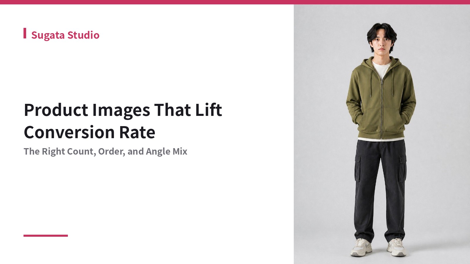
Product Images That Lift Conversion Rate | The Right Count, Order, and Angle Mix
When trying to raise a product page's conversion rate, it's tempting to start with price or copy. But drop-off data usually tells a different story: most shoppers leave after viewing just a few images. This is especially true in apparel, where "I can't try it on" is a persistent source of hesitation — and whether your images resolve that hesitation is what drives conversion.
This article focuses on three variables — image count, order, and angle mix — and how to structure them to lift conversion.
How Many Images Do You Actually Need?
More isn't always better. Too many images can slow down decision-making and increase drop-off. As a guideline:
- Minimum: 3 images — front, back, and one detail shot. Fewer than this reads as "not enough information"
- Standard: 5–8 images — front, angled, and back, plus 1–2 detail shots that convey fabric texture
- Upper limit: Beyond 10, the burden of choice increases and can itself become a source of hesitation and drop-off
Rather than treating image count as a target in itself, a better standard is being able to explain, for each image, exactly which concern it exists to resolve.
The Order You Present Images Determines Where Shoppers Drop Off
The same set of images can produce different conversion rates depending on the order. The core principle is: show the information tied to the biggest anxiety first.
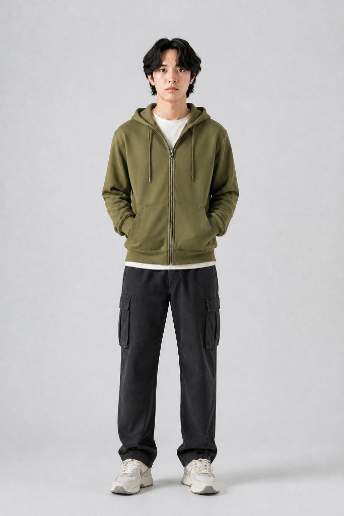
- Image 1: front-facing worn shot — conveys "what this garment is" in one second. If it doesn't land, shoppers won't scroll further
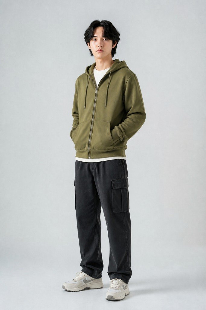
- Images 2–3: angled and back views — preemptively resolve concerns about silhouette and how it looks from behind
- Image 4 onward: detail shots — close-ups of fabric texture, stitching, buttons
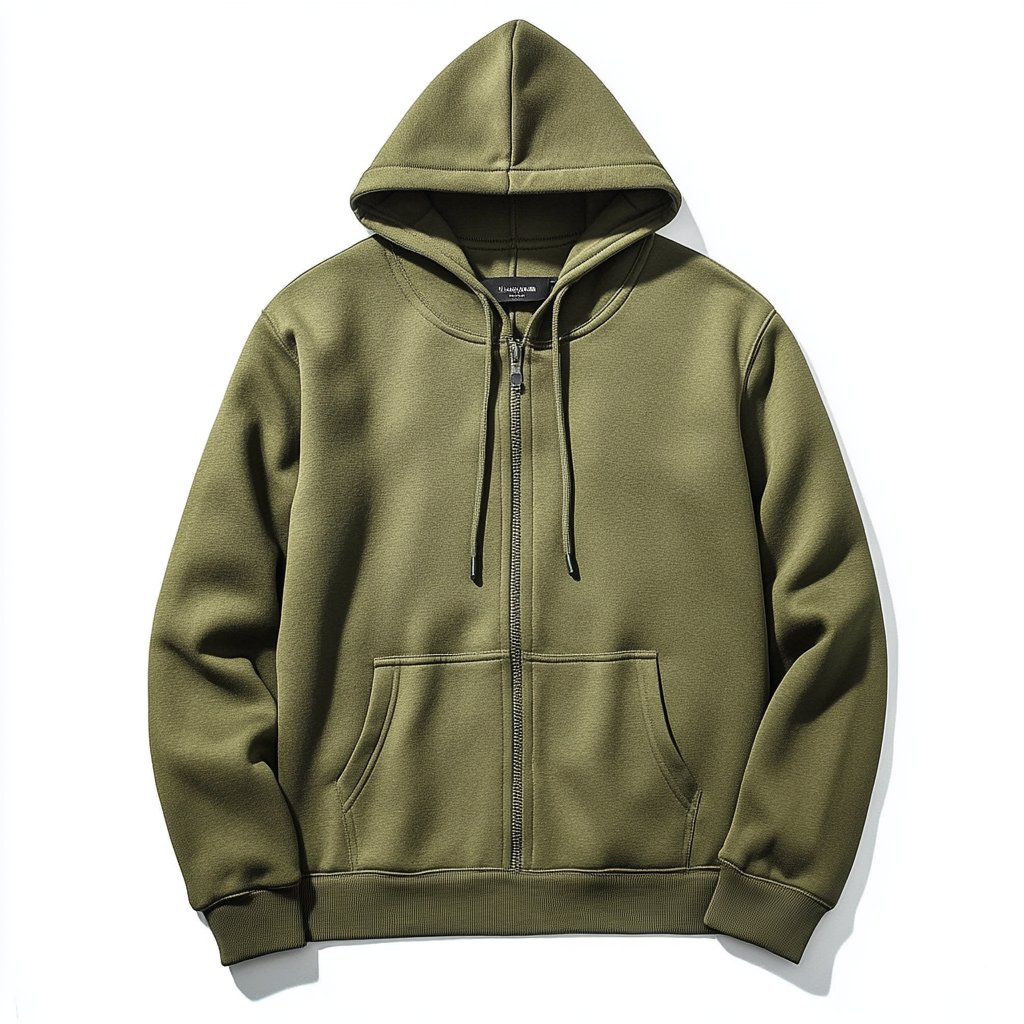
- Last: a plain white-background product shot — an "answer key" image for shoppers who want to confirm exact color and shape
This ordering echoes the approach covered in how to create multi-angle images. The underlying logic is to match the psychological flow of "notice → get interested → verify."
A Rough Golden Ratio for Angles
As a starting point for apparel worn images, this rough split tends to reduce guesswork:
- Front 40%: the main shot. Since it matters most, it's worth preparing a couple of variations (different expression or pose)
- Angled/side 25%: fills in depth and silhouette
- Back 15%: answers the question shoppers have about how it looks from behind
- Detail 20%: fabric texture, stitching, how it pairs with accessories
You don't need the exact same ratio for every product, but gaps like "only front shots, no back view" or "zero detail shots" are common drop-off causes — worth adding to your product-upload checklist.
Don't Forget the Plain Product Shot
Don't rely on worn images alone — keep at least one plain white-background product shot in the mix. It serves as the final decision point for shoppers who want to confirm exact color and shape, and it's also easy to repurpose for marketplace main-image requirements, such as Rakuten/Amazon main image rules.
Summary
Before touching price or copy, there's often significant room to improve conversion just by revisiting image count, order, and angle mix. Try restructuring the sequence — notice, get interested, verify — starting with a single flagship product.
Sugata Studio can generate front, angled, back, and detail worn shots — multiple angles — from a single product photo. If you want to test a conversion-focused image structure quickly without a photoshoot, give it a try.