Optimizing Product Images for Your Shopify Store|A Practical Guide to Sizing, Consistency, and Speed
Rakuten and Amazon enforce main-image rules. Shopify doesn't. That freedom is exactly the trap: keep uploading without deciding your own standards, and the storefront slowly turns inconsistent.
This article covers the image rules an apparel Shopify store should lock in first, and the optimization steps that actually affect conversion and page speed.
First decision: one aspect ratio, everywhere
Shopify collection pages arrange your images in a grid. Mix squares with vertical shots and the rows stop lining up — which alone makes the store look unfinished.
For apparel, standardize every product on one of these:
- Square (1:1) — versatile, easy to reuse on social
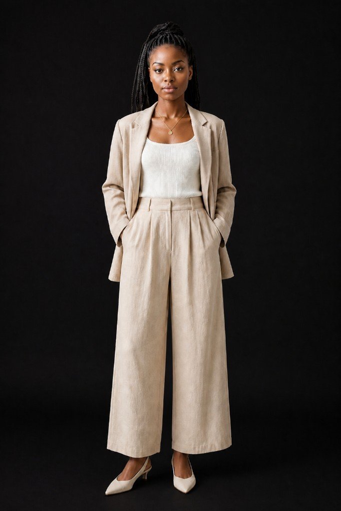
- Vertical (4:5 or 3:4) — fits full-body worn shots, well suited to apparel
Which one wins depends on your theme. What matters is not mixing them. Reworking every product later is expensive, so decide while your catalog is small.
Size and format guidelines
Shopify recommends images of 2048×2048px or larger, with an upload cap of 5,000×5,000px and 20MB. In practice this is enough:
- Upload JPEGs at around 2048px on the long side (quality 80–85)
- WebP conversion and per-device resizing are handled automatically by Shopify's CDN — no need to convert yourself
- Only use larger originals for products where zoom matters (weave, embroidery)
Oversized originals don't look better; they just get heavier to manage. Around 2048px is the balance point between "not bloated" and "survives zoom."
Alt text is a search entrance
You can set alt text per product image in the Shopify admin. Most stores leave it blank, but it's one of the few settings that helps both Google Image Search traffic and screen-reader accessibility.
Keep it simple: one sentence with color, material, item name, and angle — "Beige linen shirt dress, front view, on model." Don't paste the same sentence on every image; reflect what each shot actually shows.
Structuring the product page gallery
The first image should communicate what the product is within one second — for apparel, that's an on-model shot. From the second image on, add angles to preempt the "can't try it on" doubts.
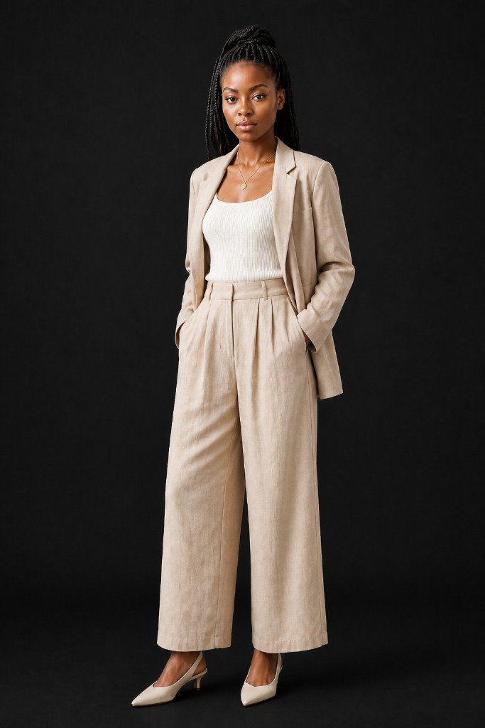
The ordering logic is covered in our multi-angle article; the short version is front → 45 degrees → back → detail, answering the biggest doubts first.
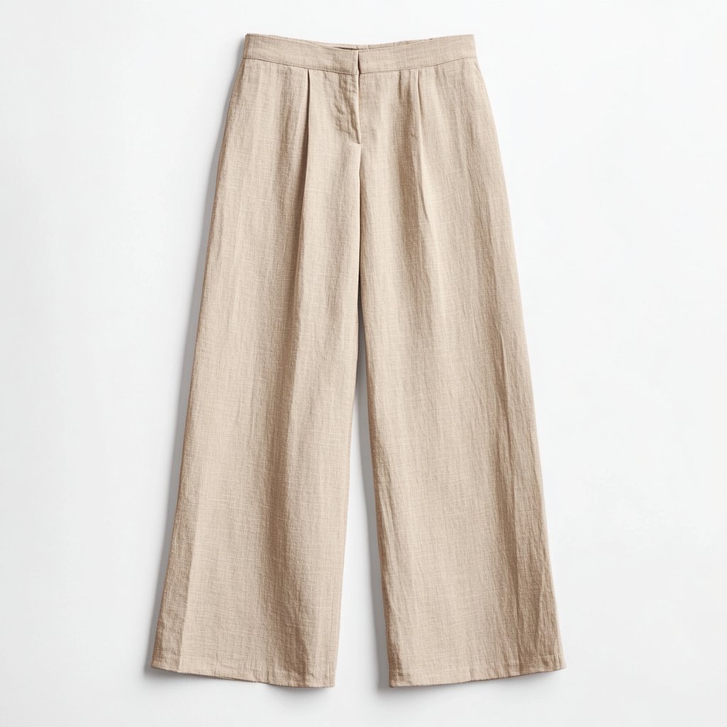
Include one clean product-only cut on white as well. It works as a color and shape reference, and reuses well for social ads or marketplace listings later.
Page speed is an image problem
Images are almost always the heaviest part of a product page. Speed feeds into Google's Core Web Vitals, so slow pages lose on both search ranking and mobile bounce rate.
Shopify automates a lot, but two things remain your responsibility:
- Don't upload needlessly large originals (the 2048px guideline above)
- Don't overload the gallery — eight well-chosen images beat twenty, for load time and for the shopper's decision speed
Summary
Before installing any optimization app, you get most of the way with the basics: one aspect ratio, 2048px JPEGs, alt text on every image, and an on-model first shot. Set the standard once and apply it to every product.
With Sugata Studio, one product photo generates on-model images in multiple angles, with consistent framing and backgrounds — so you can grow your catalog without losing the store's unified look.